Extra Gum Series
Overview: How might we develop creative and expressive micro-interactions that go beyond ‘usable’ to achieve ‘delight’?
For each series of interactions, the creative process is documented with sketches, storyboards, and static graphics. After exploring the documentation aspects, the interactions were developed and animated into the accompanying motion graphics.
Designers: Devin Kirkwood
Skills: UI/UX, prototyping
Tools: Figma, Adobe After Effects, Adobe Premiere Pro
Duration: 11 weeks
When: January - April 2021
Brand
Each interaction was consistent in representing Extra brand gum. To achieve this, the colors, interactive state formats, and overall aesthetic was used repeatedly throughout the project. Content and inspiration were taken from the Extra website to accurately portray the visual style.
Context
The interactions were originally intended to be designed as a kiosk but based on plausible user experiences and the inclusion of hover states, designs for a website allowed for more freedom and sensible user experiences.
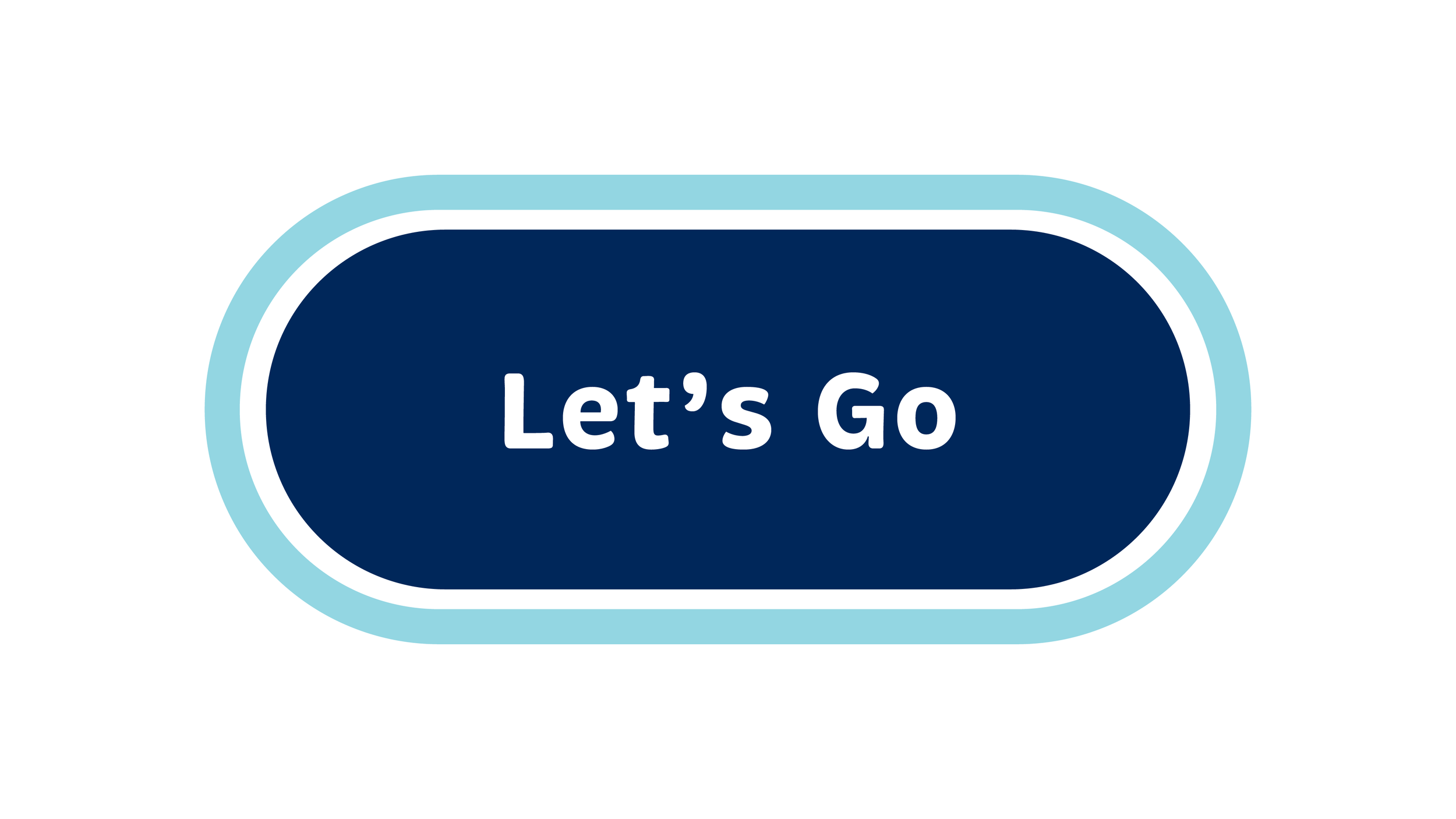
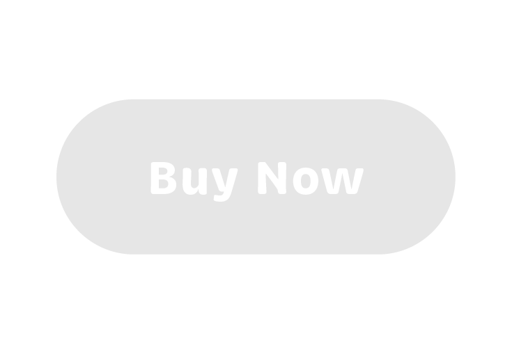
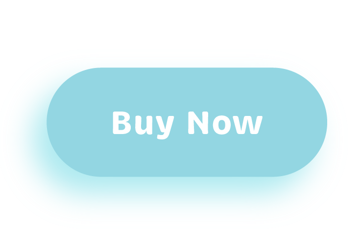
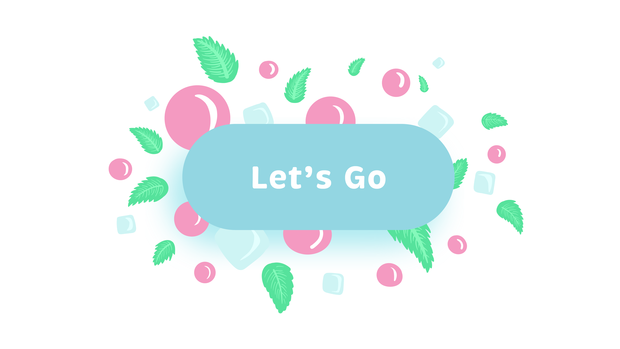
Basic Button
The primary basic button is the default, the most common button style. It has a clearly distinguishable ‘call-to-action’ (CTA). These buttons commonly include action verbs, i.e. Go, Continue, Send, Add to Cart, Checkout, etc.
Inactive
Click

Active

Selected

Hover
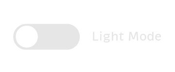
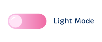
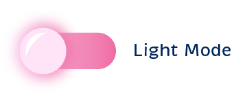
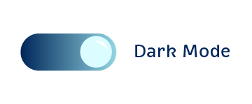
Toggleswitches, Multi-Position Switches & Sliders
Toggleswitches have two positions and can act as a binary filter. Multi-position switches have three or more options and are commonly labeled. Sliders are typically linear and indicate the position within a range.
Inactive First State
Active First State
Hover State
Active Second State
Basic Toolbar
Toolbars are simple menus that often consist of icons and text labels. Only one item can be active at a time, and typically one is selected by default.
Home Selected

About Selected

Flavors Hover

Cart Hover

Flavors Selected

About Hover

Cart Selected

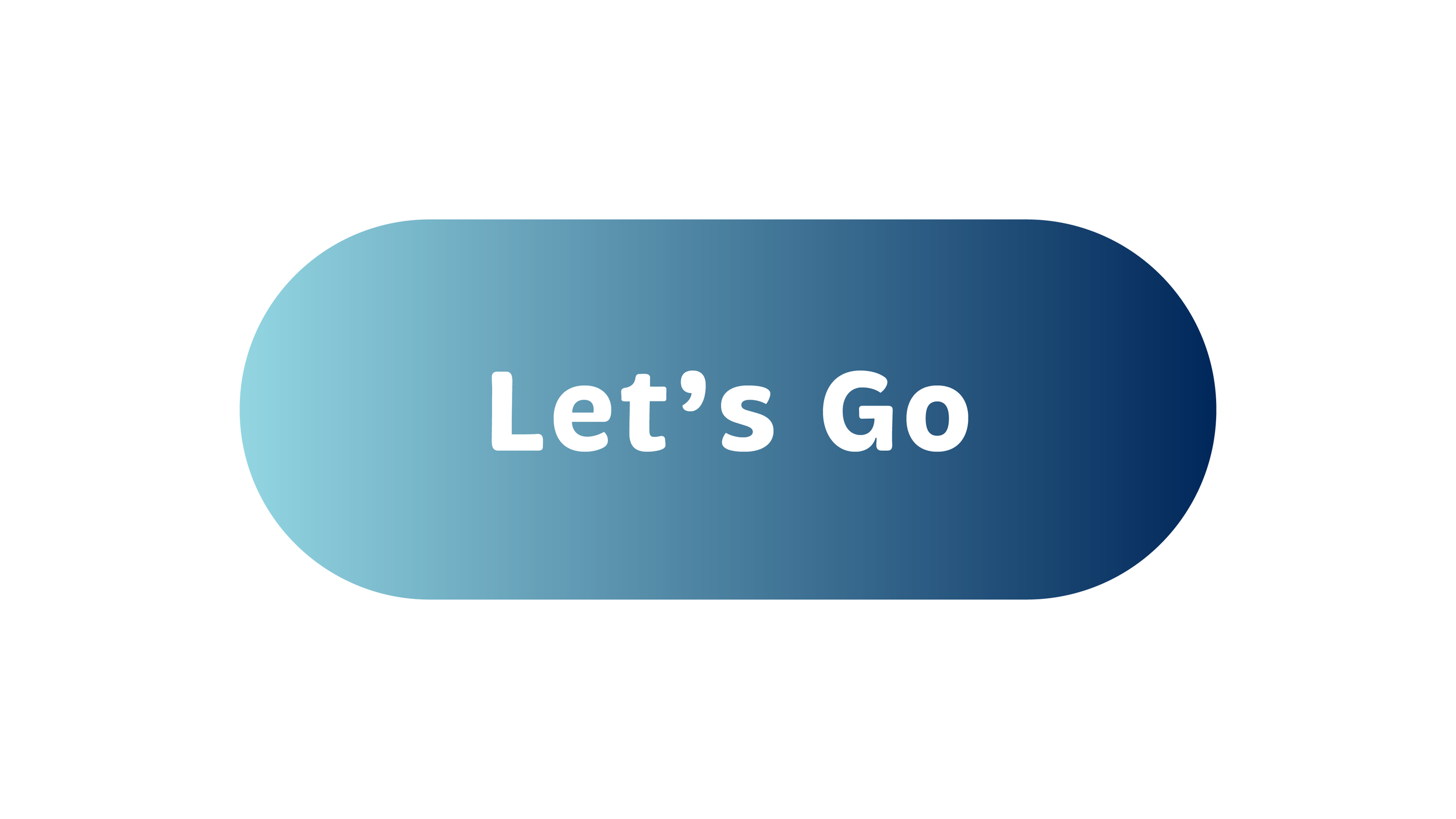
Big Button
The big button is the beginning of the interaction and sets the tone for the rest of the experience. It’s the most embellished button because it takes up more of the user’s time and attention.
Active
Hover
Click

Transition